
As a fitness business owner, having a professional website isn’t an option – it’s a requirement. And one of the most important pages on your website is your landing page.
Unlike other website pages, there are multiple parts of a landing page.
If you want to make sure you hook your audience, and keep them on your website, you’ll need to make sure every part of your landing page is on point.
Let’s take a closer look at a breakdown of a landing page.
I’ll also include some screenshot examples of what works so that you can easily set up your landing page today.
What is a Landing Page?
There are several essential pages on a fitness website, but the landing page is (typically) the FIRST page that visitors will see when they come to your site.
Obviously, a lot of thought and effort should go into creating good landing page content, as it can be the make-or-break for your website.
Your landing page is a key component of your website that helps to promote and sell your products or services.
Why is a Landing Page Important?
The goal of a landing page isn’t just aesthetics. It’s there to help convert visitors into customers.
This might not necessarily (and rarely does) happen in one exchange.
While the long-term goal is to get consistent and loyal clients, your short-term goal with the landing page could be to get people to sign up for your newsletter.
Once you have their contact information, you’ll be able to send them value-focused marketing content such as newsletters and blogs.
This will help to increase your credibility while building trust with these prospects.
What Are the Parts of a Landing Page?
Your landing page should be designed to get the user to take action.
While you can go crazy with design elements for your landing page, I’d say less is more.
Keep it simple. Make it match your brand. And maintain a clear and consistent message:
My product / service is awesome, and here’s how it will solve your problem.
Here’s the basic rundown of a landing page.
The Hero Section
This is the top of the page. This should contain the following:
- A catchy headline that states what you’re offering
- A subheading that elaborates on your offer
- An image or video that creates a good first impression while demonstrating what you offer
- Call-to-Action link (if it applies to your business)
Let’s take my travel fitness blog as an example.

From the headline and short description, you know that I offer information about how to stay fit while traveling.
The background image also reflects that, and to drive the point home, I have a short video.
This video covers what the reader can expect to read about, my background and credentials, and the benefits for the viewer if they read my content. All of this is demonstrated in under 60 seconds.
Preview of Your Product / Services
If this applies to you, I recommend a banner after the hero section that allows the viewer to sample what you’re offering.
If you only have a fitness blog, then you might jump right into your most recent posts or social proof.
But if you offer fitness services or products, you may want to have something here that quickly previews what is to come.
Let’s take this website – writefit.com – as an example.

I am a fitness copywriter, and I provide four services to fitness businesses: blog posts, copywriting, ebooks, and content roadmapping.
Someone might not necessarily click on these right away, but it sets the stage for what they’ll learn about below.
Social Proof
Social proof is basically anything that demonstrates to the user that others have tried your product or service and liked it.
This could be customer reviews, media mentions, awards, etc.
You can use a “As Seen On” banner, if you’ve been featured in a magazine, television show, podcast, etc.
If you have genuine social proof from previous customers, use it.
Leave this section out if you don’t. Do not create false testimonials or pay someone to leave a fake review. This usually backfires, especially with the rise of review-checking apps like FakeSpot.
I would also recommend placing more social proof further down before your call-to-action.
For this example, we’ll use my B2B website again:

I’ve included a slider bar here with five quick and easy-to-read testimonials.
Again, it’s building the scene and helping the viewer understand more of what you do and what others are saying about you.
Benefits and Features of Your Product / Service
This is arguably the most important part of your landing page.
Here, you’ll want to list the benefits and features of what you’re offering.
Features and benefits are not the same thing. What’s the difference?
A feature of a product or service is a factual statement about what it is or how it works.
On the other hand, a benefit is the value that the user will experience by using your product or service.
For example, if you’re selling a fitness program, a feature might be that it’s a 12-week weight loss program.
A benefit would be that it will help the user to regain the confidence they had when they were in college, feel better about themselves, and turn heads at the pool.
It can be very tempting to ramble on and write as much as you can about your products or service.
Fight this temptation.
Make it short, sweet, and captivating. The user needs to be able to easily scan your website, understand what they’re getting, and learn more about your products and services if they want to.
On this website, I’ve narrowed down the benefits to four things:
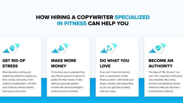
By letting me take care of their fitness marketing, clients are going to be able to make more money, have time to do what they actually want to do, and become an authority in their niche.
My services are features. These are benefits.
Call-to-Action (CTA)
This is what you want the user to do next.
For example, if you’re selling a fitness program, your CTA might be “Sign Up Now” or “Download the Free Ebook.”
If you’re a personal trainer, your CTA might be “Schedule a Free Session.”
Make your CTA button stand out from the rest of the page by using a different color or making it bigger.
I have several CTAs on my landing page, all of which are getting the viewer to set up a discovery call with me so I can learn more about them, their business, and their projects.
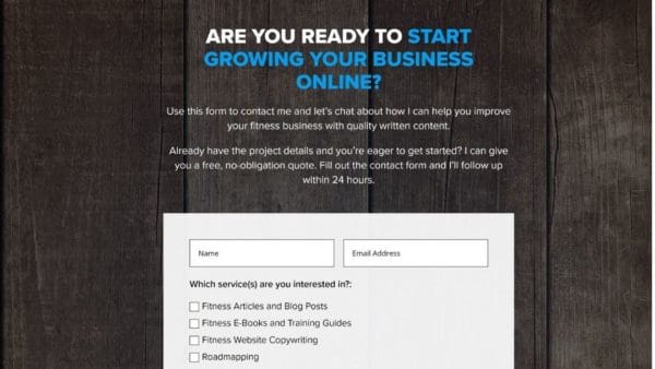
Depending on your fitness business, you might not need a contact form like this, but I choose to use one because it helps both me and the prospect.
For the prospect, it helps them define what type of service they are looking for. For me, it gives me an idea of whether my services would be a good fit for them.
Have Any Questions About Parts of a Landing Page?
The importance of your landing page cannot be understated.
If you need some help with getting the parts of a landing page set up, reach out and let’s chat about your fitness website.
Did you manage to set it up and you’re happy with the layout? Now, it’s time to start writing.
Here’s a guide on how to write content for a landing page.